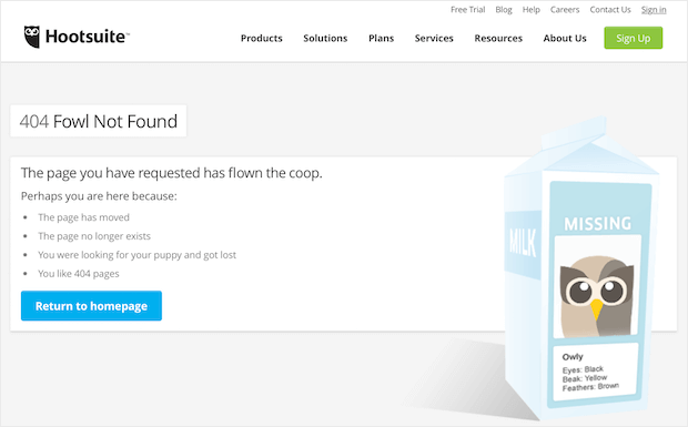
What if we told you that your 404 error page could actually increase your conversions and boost revenue?
Mind blown, right? We know it sounds too good to be true, but with some effort crafting the right 404 page design and proper optimization you can turn lost visitors into loyal customers.
In this post we’re going to cover 9 of the best 404 pages we’ve seen and why they work.
First, though, let’s briefly talk about 404 pages and why they matter.
What Is a 404 Error Page and Why You Should Care
Links go bad over time. It happens on every site. Products get removed, content gets deleted, or there are changes in permalink structure.
When a visitor clicks on a link to a deleted or moved page they’ll see your 404 error page. They’ll also see it if they mistype a URL, or click on a broken or truncated link.
Does your 404 page reflect your brand?
If not, you are absolutely losing visitors who may write you off and never come back.
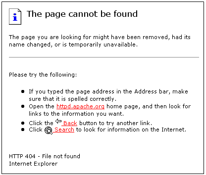
This…
Is not a good look for anyone.
Taking time to optimize your 404 page text and create an on-brand design can really reduce your bounce rate and increase your conversions.
As promised, here are 9 404 error page examples to inspire you and help you create your own custom 404 page.
1. Lego – Friendly “Page Not Found” Error
Why it works:
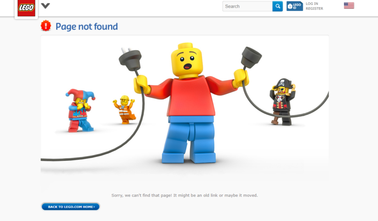
Not only is Lego’s 404 page 100% on-brand, it’s also fun and easy to understand. There’s no technical wording and no reference to a “404 error” that some folks may not understand.
All your visitor needs to know is that they didn’t get the page they wanted. They don’t really care about the why; they just want a solution.
How to do it:
For starters, replace the techy stuff with normal human language. Instead of the default 404 message, use phrases people will understand:
- “Page not found.”
- “Sorry, we can’t find the page you were looking for.”
- “Oops! Something is broken.”
- “Oh dear, this link isn’t working.”
2. Email Center UK – Interactive 404 Page Example
Why it works:
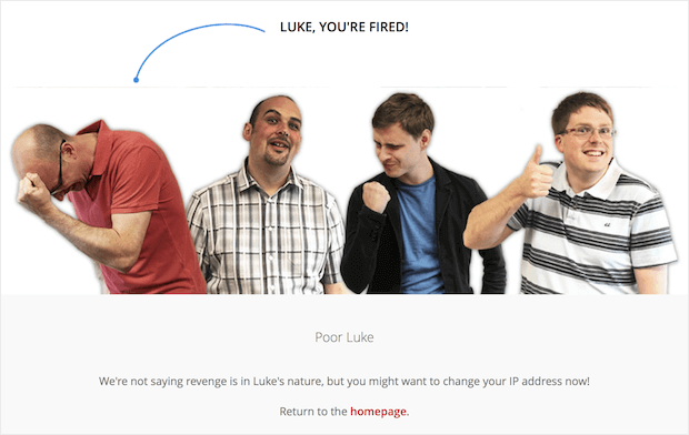
Email Center UK uses a two-part 404 page that takes all of the blame off the visitor, giving the visitor a fun way to work out their 404 frustrations.
How to do it:
Don’t blame the visitor for the error. Instead, be apologetic.
If you’re explaining what went wrong, don’t use absolutes. Instead, use words and phrases like “might have” or “possibly.” This wording is less likely to make the visitor feel like the error is their fault.
You could also do what Email Center UK did and let the user “fire” one of the developers.
Poor Luke, indeed.
3. List25 – Best 404 Page
Why it works:
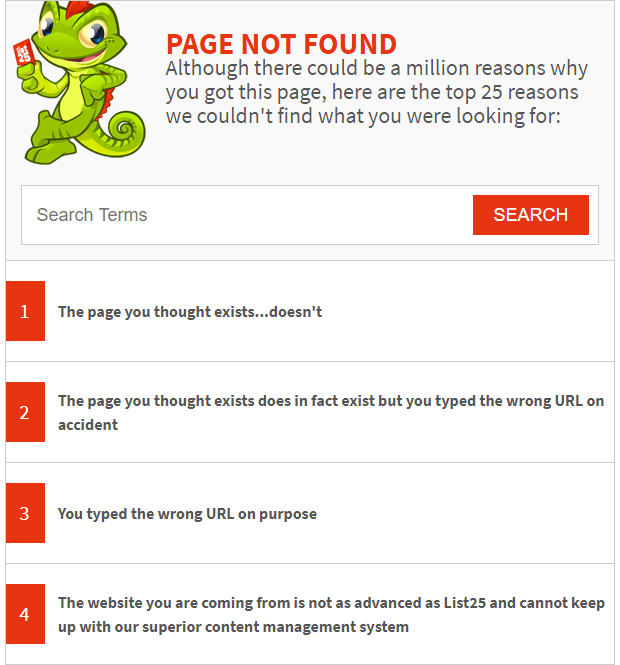
This 404 error page from List25 is brilliant and so on-brand it hurts.
User experience design best practice is to provide explain what went wrong when delivering an error message. List25 offers 25 explanations. Naturally.
They have a search bar at the top so visitors don’t have to scroll all the way through the list, but we’re pretty sure that most List25 visitors are going to anyway.
How to do it:
Most sites aren’t going to have a list of explanations like List25, but definitely take a minute to explain what went wrong.
Here’s a list of possible reasons for the 404 error:
- Mistyped URL
- Copy-and-paste error
- Broken link
- Truncated link
- Moved content
- Deleted content
If you want to throw in some fun ones that work with your branding, do it!
4. Brett Terpstra – Simple 404 Page Design
Why it works:
One of the most annoying things about 404 error pages is that it can signal a dead end. If the page isn’t well-designed, you may end up with nowhere to go next.
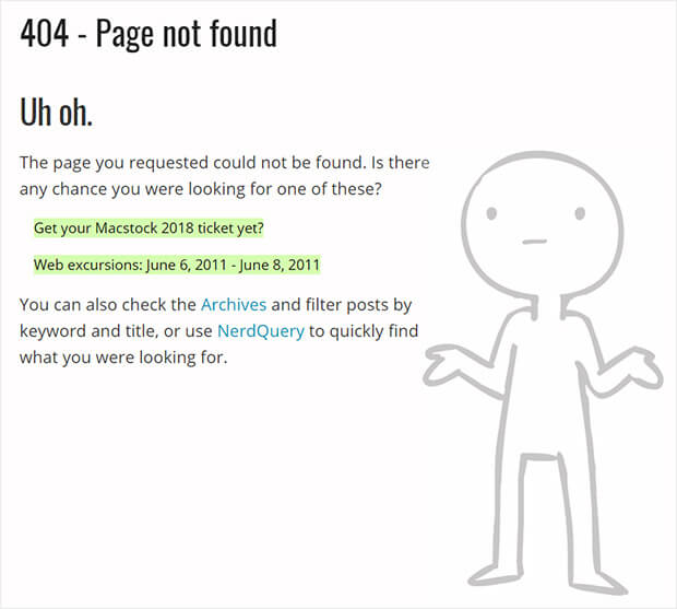
Brett Terpstra’s 404 page provides a list of posts containing keywords related to the link you were trying to access. The posts are linked making it easy and fast to navigate to them.
The page isn’t showy, but it’s exceedingly useful.
How to do it:
You can use Google’s Custom Search API to get best matches from your website to show up on your 404 page. This gives visitors an immediate solution to their lost page problem.
This requires accessing Google’s Developer Console and isn’t for the faint of heart.
5. Steve Madden – 404 Page With Products
Why it works:
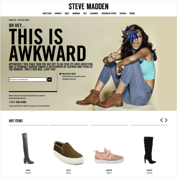
Steve Madden’s 404 page offers up options to lost visitors. The search box is a great addition to any 404 error and offering a few different ways of getting help lets visitors know that they’re listening.
They also include links to other popular products to distract visitors from what could be a very frustrating experience. Sneaky and effective.
How to do it:
Help your lost visitors out with your 404 error message text and design. Including some of the ideas below can encourage visitors to continue browsing and searching, extending their time on your site.
Some things to include in your 404 page design:
- Menu navigation
- A link back to the homepage
- A link to your sitemap
- A search bar
- Links to popular posts
- Links to popular products
6. 9gag – 404 Page Text With Call-to-Action
Why it works:
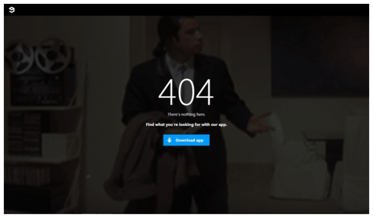
9gag’s 404 page has one purpose: to get you to download their app. They don’t even pretend to want anything else.
Adding a full page of the popular Pulp Fiction Travolta gif is a fun touch!
How to do it:
Simplicity is key. Yes, we just talked about offering up ways to keep your visitors browsing, but don’t overwhelm them with too many options.
Ideally, you should stick to a single call to action, maybe two. You don’t want visitors to suffer a wave of indecision paralysis and flee your site in terror.
The grass is always greener, right? If you give your visitors too many options, they may end up regretting their choice and resenting you for it.
7. Path – Super-Simple 404 Page Design
Why it works:
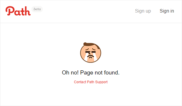
Path’s 404 page is simple and straightforward. They don’t want to have broken links and missing pages so they give visitors the option to contact Path support to report it.
Notice that Path also includes a navigation footer in case the visitor doesn’t want to report the problem and would rather browse around. This gives the power back to the visitor and helps to ease their frustration.
How to do it:
The goal here is to give visitors a chance to report the problem.
You can do this in a few ways. You can keep it simple like Path and include the option to contact support. Another option is to use a feedback form.
8. IMDB – Funny and On-Brand 404 Page
Why it works:
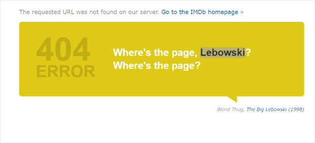
Remember that terrible default 404 error page from the beginning of this article? There’s no familiarity for your visitor to take comfort in. IMDB eliminates that by showing visitors a movie quote on their 404 page.
The branding is subtle here. There’s no movie posters, no trailers competing for the visitor’s attention. IMDB simply offers up a movie quote, a link to the site’s homepage, and a link to the quoted movie.
How to do it:
When designing your 404 error page, make sure to maintain brand familiarity.
Rather than disorienting your users, it will be reassuring for them to experience the same brand that they have come to know.
9. Heyzap – Best Interactive 404 Page
Why it works:
Who doesn’t love to play games?
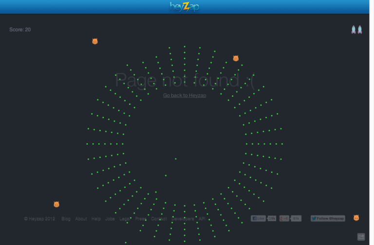
Heyzap’s 404 page adds an interactive element that will keep visitors entertained and engaged on the site for a while. Maybe even long enough to get over their frustration of landing on an error page in the first place!
How to do it:
No, you don’t have to develop a game, but do consider adding an interactive element to your page.
Adding an interactive element gives your site’s visitors something to do on your 404 error page. This increases time on page and reduces bounce rates, both important for keeping your website in Google’s search results.
There you have it! 9 of the best 404 pages we’ve found and tons of tips you can use to increase conversions and boost revenue.

