So in this article, we’re not going to explore the seven most obvious landing page hacks; we’re going to explore the seven most impactful landing page hacks that often fly under the radar.
That means landing page tactics that produce the biggest impact with the least amount of effort.
When you’re finished, you’ll have a recipe for high-converting landing pages that don’t cost you a whole lot of time and resources you don’t have.
Let’s dive in.
1. Align intent, channel, and offer
Implementing this one landing page hack will lead to the biggest boost in conversion rates bar none: aligning intent, channel, and offer.
Conversion intent refers to the goal your landing page visitor intends on achieving, whether that be a purchase, demo, download, or something else. More specifically, when we talk about conversion intent, we want to know whether or not your visitor is in-market, ready to buy (hot), or out-of-market, not ready to buy (cold).
Different channels signal different conversion intent. For example, someone who visits your webpage via a purchase-intent keyword on Google has a higher intent to buy than someone casually scrolling Instagram. This is why channel and intent go hand-in-hand.
The trick is to now align your offer with the intent of the buyer based on the channel they found you (through your call-to-action).
For example, you wouldn’t want to ask cold Instagram visitors who have never heard of you before or who have never signaled intent to buy to “schedule a demo.”
Just like you wouldn’t want to ask hot Google PPC visitors who discovered you via a branded search term to “download a free ebook” or “register for a webinar” when they likely want to book a demo.
Instead, you want your landing pages to make hot offers to hot traffic from hot channels, and cold offers to cold traffic from cold channels.
Like our founder says, “ice cube” traffic is traffic that arrives on your landing page and has no idea how they got there. “Volcano” traffic, on the other hand, is traffic that knows who you are and is interested in buying what you offer.
When it comes to channels, display typically provides the coldest traffic whereas search typically provides the hottest traffic.
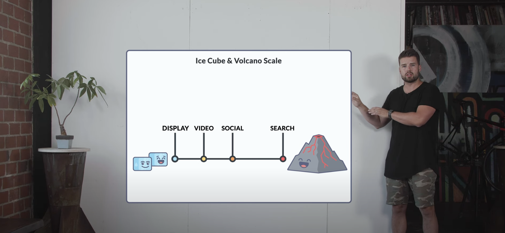
As for offers, you can get away with making a cold offer (i.e., a download or webinar) to hot traffic, but not the other way around. This is why we recommend following the four rules below:
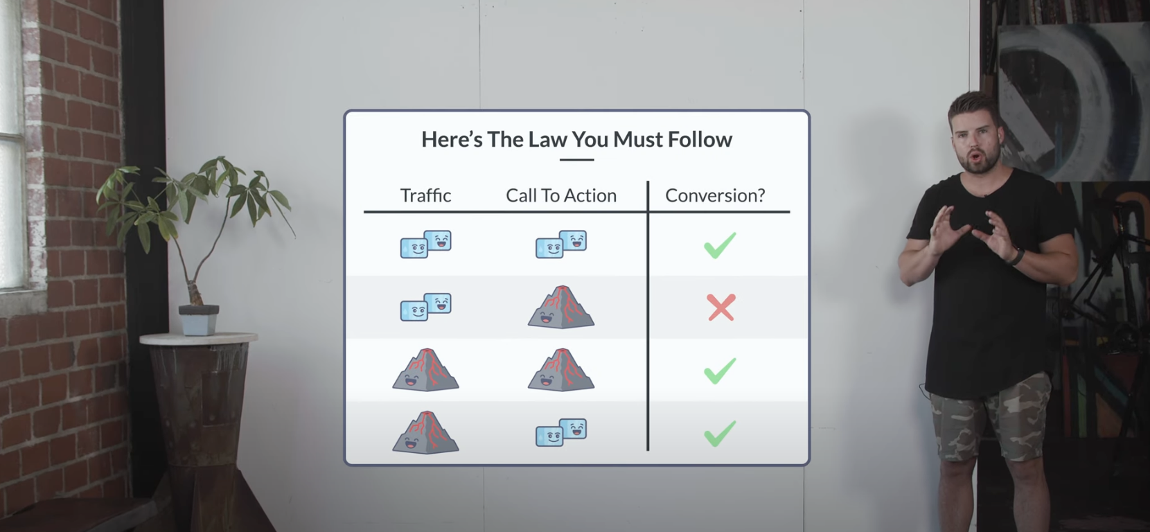
Bottom line?
If you want to keep your landing pages converting and lead quality high, you need to find the harmony between intent, channel, and offer.
2. Take control of landing page traffic
When it comes to your ad campaigns (search, social, display, or video), there’s what you see on top of the surface, and there’s what actually happens below the surface.
For example, take search PPC ads.
There are the keywords you bid on vs. the search terms that actually trigger your ads.
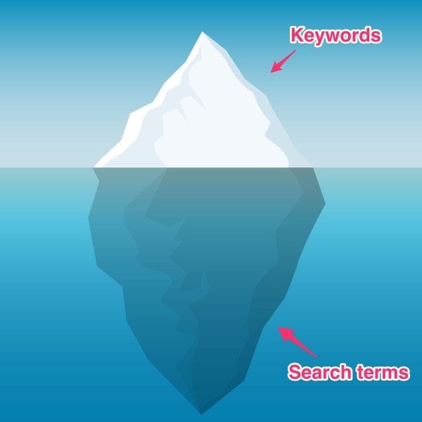
At KlientBoost, we call this The Iceberg Effect.
The Iceberg Effect occurs when the discrepancy between the keywords you bid on (what you can control) and the search terms you pay for (what you can’t control) is massive—like a giant iceberg.
Let’s look at a real-world example.
Below, notice how this account is only bidding on one keyword (broad match): “File for bankruptcy.”
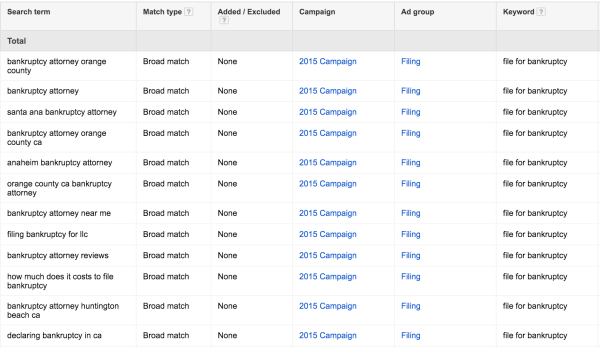
Also, notice how many search terms that one keyword triggers (136 search terms to one keyword). That’s a big iceberg.
What are the chances that someone who searches for “bankruptcy attorney,” “filing bankruptcy LLC,” and “file bankruptcy” all have the same intent?
Pretty slim.
This results in two problems:
- Low relevance: It’s hard to write relevant ad and landing page copy when you can’t control who sees them. This is a problem because Google uses relevance to determine your CPC. How? Click-through rate (CTR). The more relevant your ad to the search term, the better your CTR, the better your Quality Score (QS), the lower your CPC, and the lower your CPA. You can’t accomplish that with a big ol’ iceberg in your way. Not to mention low relevance leads to high bounce rates.
- Inconsistent testing: When your iceberg gets too big, you lose control and granularity over who visits your landing pages. Consequently, you’re bound to drive traffic to your landing pages that have no actual business being there. This makes A/B testing messages, offers, headlines, and CTAs difficult to evaluate and inconsistent (A/B tests need a controlled environment to work effectively).
And if you thought the Iceberg Effect only referred to paid search ads, think again.
It also affects social ads, display, and video campaigns (but in the form of targeting layers).
For example, with Facebook ads, you can layer dozens of targeting filters over your ad sets, like household income, gender, job title, etc. But too many targeting layers makes it impossible to know how each respective layer performs on its own, thus creating an iceberg.
So to ensure consistency in ad messaging and landing page testing, reduce the size of your icebergs as much as possible.
When it comes to PPC, get your ratio of keywords to search terms as close to 1:1 as possible by using SKAGS (single keyword ad groups). Smaller ad groups = more control.
When it comes to paid social, display, and video, limit ad sets to the fewest amount of targeting layers as possible. Smaller targeting criteria = more control.
Once you know how individual targeting layers perform on their own, then you can start layering them for best results.
3. Use the Breadcrumb Technique™
What’s the Breadcrumb Technique?
It’s the landing page equivalent of the “Yes Ladder.”
Borrowing principles from behavioral psychology, the Breadcrumb Technique breaks up your landing page forms into multiple smaller steps (multi-step form), placing the least threatening questions first and the most threatening questions last.
Why does it work? Compliance psychology.
When people actively commit to something, they’re much more likely to complete it. So the Breadcrumb Technique makes forms appear smaller and less daunting in order to get visitors to commit or take the first step. Once they do, there’s a higher chance they’ll complete the form than if you just showed the entire form from the start.
For example, notice how we break up our “free marketing plan” form into four different steps:
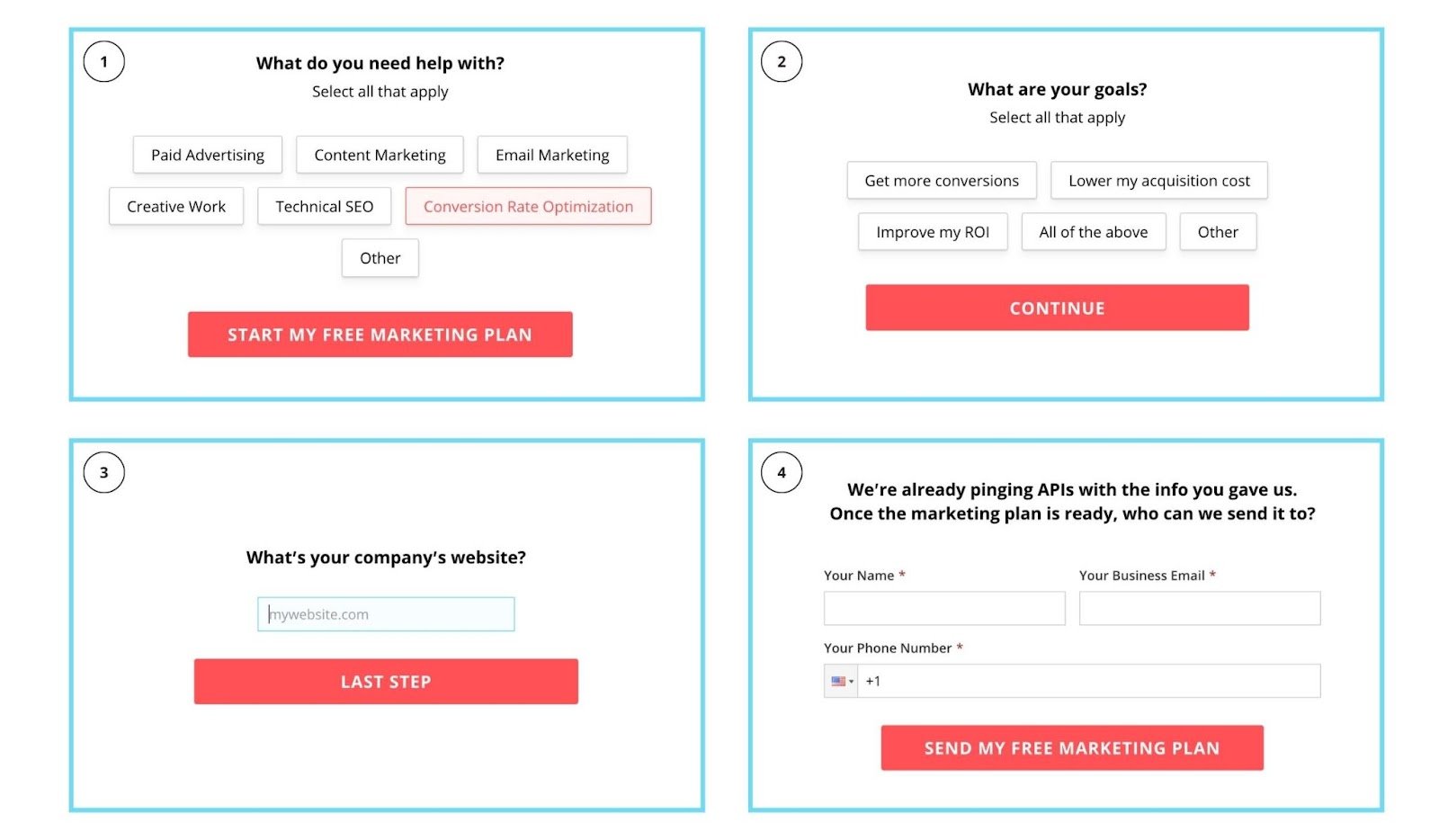
When a visitor clicks on our CTA, this is what they see:
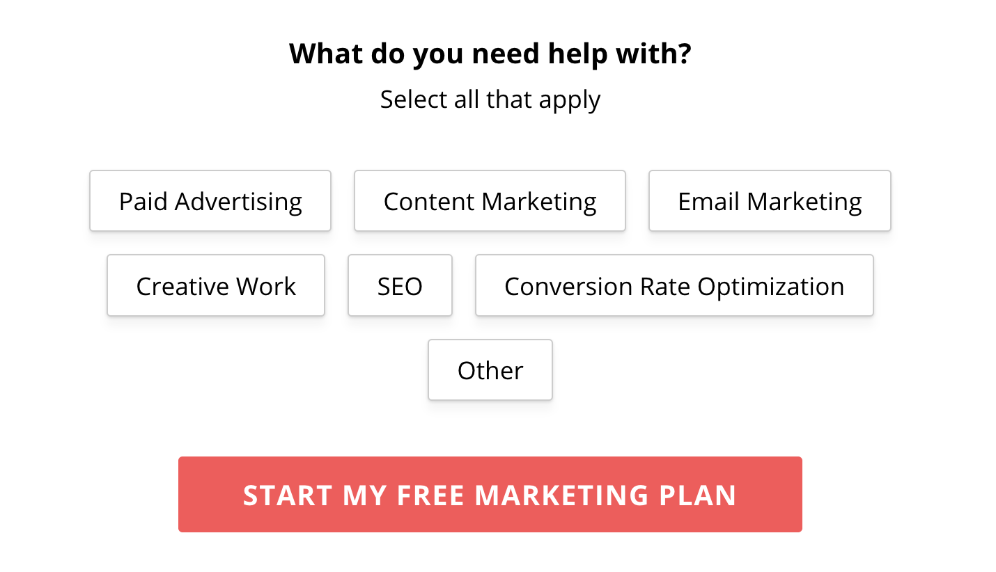
We don’t show visitors all six form fields at once.
We just show them one: “What do you need help with?”
After they select an option, they progress to the next step:
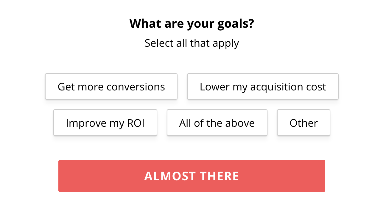
We could have just placed all six form fields on one single column form, or we could have whittled away fields until all we had left were name, phone number, and email. But both options would have left visitors with a highly threatening proposition. (Not to mention removing important form fields could lead to lower quality leads.)
To increase conversions, we opted for a multi-step form.
And to this day, with over hundreds of clients managed, the Breadcrumb Technique consistently leads to the largest boosts in conversions compared to most other landing page split tests.
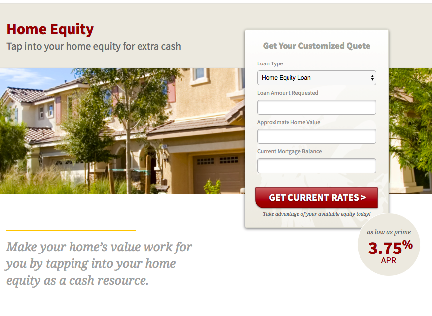
For example, by converting this client’s form from one step to multiple steps (and asking for name, phone, email on the last step), we increased their conversion rate from 1% to 20%, increased lead volume from six to 135, and decreased CPA by 95%.

4. Increase motivation with perfect CTA copy
Over the course of literally thousands of tests, we’ve discovered that, over and over again, visitors home in on the wording of the CTA copy immediately.
This might mean that the quickest way to boost conversions is often as small as rewriting your CTA buttons.
How?
We wrote an entire article on high-converting CTA copy, but let’s review the three main points:
- Use strong verbs: Strong verbs communicate value, not effort; receiving, not giving. Words like “submit,” “start,” “schedule,” “pay,” “learn,” and “send” all communicate effort. On the flip side, verbs like “save,” “get,” “join,” and “start” express the value a visitor is about to receive.
- Emphasize value: Value starts with strong verbs, but it doesn’t stop there. Your entire CTA phrase should emphasize value by describing how you plan on fulfilling the promise your value proposition made. For example, using our digital marketing plan offer, what sounds more motivating? “Schedule a consultation,” or “Get a free marketing plan”?
- Handle objections: Last, handle last-minute objections about your offer directly within the CTA if you have room. For example, can you temper anxiety about your free trial by adding “No CC required” to the CTA copy? Or can you handle objections about the time investment it will require to sit through a consultation by adding “in 15 minutes” to your CTA copy?
Let’s look at this in a real-life example.
We’ve gone through five different variations of our CTA copy, each variation delivering higher conversion rates:
- Get free trial
- Get free audit
- Get free proposal
- Get free marketing plan
- Start my pricing calculation
Not a single thing has changed about what a prospect actually receives. In all cases, it’s always been a comprehensive and customized marketing plan. The only thing we’ve changed is the CTA copy to better align with the value our prospects want to receive.
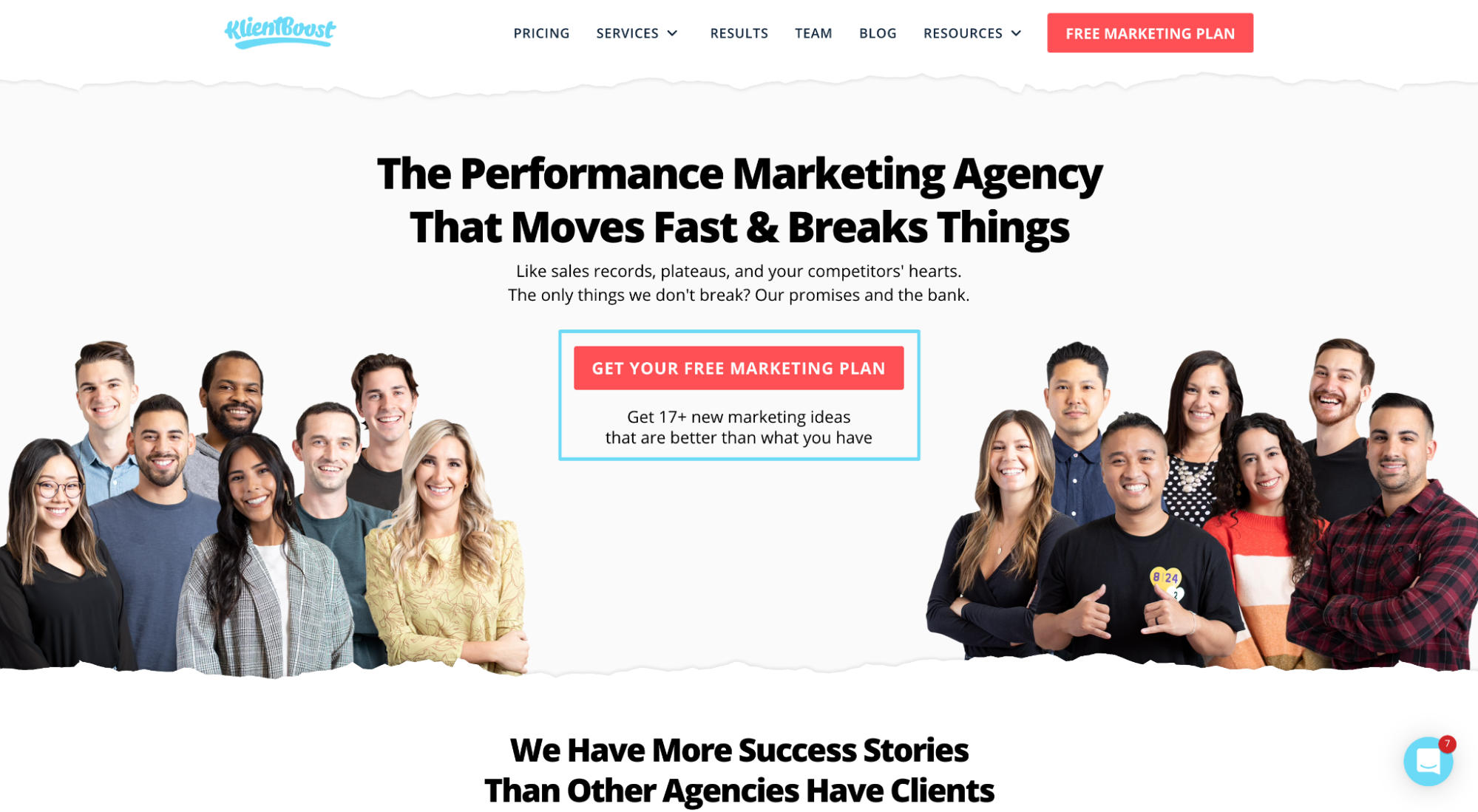
So before you start adding high-effort features like ROI calculators, widgets, new sections or embeds, simply A/B test your CTA button copy first.
5. Optimize your thank you page
Too often, marketers get caught up creating the perfect landing page layout that they forget it’s only one step in the entire conversion funnel.
What happens after a prospect fills out the form or converts on your CTA is just as important as what happens before.
Think about it. If someone has just given you his or her contact information, you’ve arguably just crossed the most important step in your conversion funnel. Don’t mess it up.
For example, when you fill out a demo request for a SaaS company, you’re typically met with a generic thank you page like this:
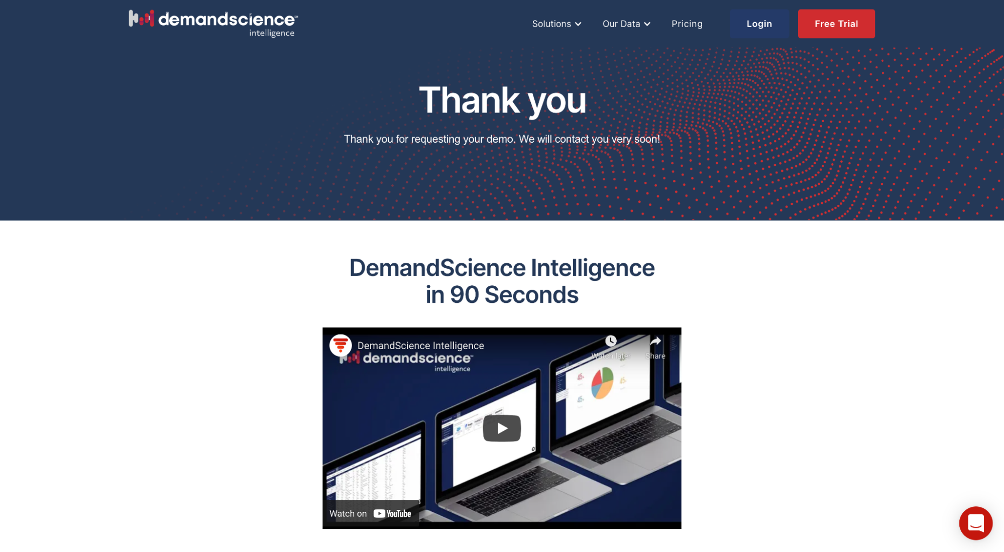
That might be great for tracking conversions but not so great for your prospects or your funnel efficiency.
Who’s going to contact me?
When are they going to contact me?
By phone or email?
How long will a demo take?
Why should I trust this demo is going to help?
If your conversion path is like a flowing river from one stage to the next, a generic thank you page is like a dam.
Wouldn’t it make more sense to use your thank you page to eliminate friction, improve their user experience, and make the buying process as easy as possible?
For example, notice how ChiliPiper uses their thank you page to let prospects book their own demo day and time.
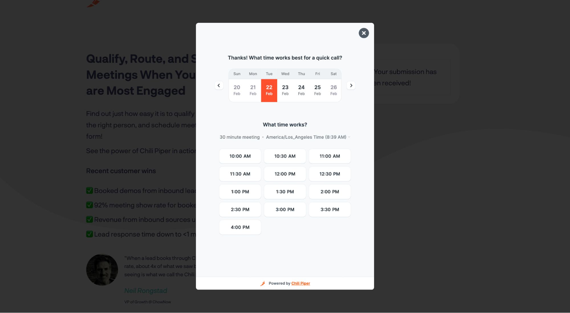
ChiliPiper smartly lets prospects schedule their own demo.
This keeps your leads engaged and expedites the process on both of your behalves.
Here are some more examples of an engaging and optimized thank you page:
- Next steps: At the very least, let your prospects know the who, what, when, and where of the next step in your conversion process. Don’t leave them guessing.
- Case studies: Link to relevant case studies. Did a prospect convert on your PPC service landing page? Then hit them with a couple of PPC case studies before your meeting.
- Social proof: Testimonials, awards, client logos, client numbers, star ratings…the list of social proof examples goes on and on. Remind your prospects that they’re making the right choice with the social proof to back it up.
- Helpful resources: Provide relevant links, social media profiles, free downloads, etc. Give your prospects any content that will help prepare them for the next step better and faster.
6. Use social proof everywhere
Most of you have heard of social proof before.
If not, social proof refers to third-party recommendations (customer testimonials, association awards, etc.) that are in favor of you, your product, or your brand. In other words, it’s any indication to a potential customer that people in the same situation chose you and had success.
Luckily, we wrote an entire article on landing page social proof. So we won’t dive too deep here.
But the landing page hack we want to explore is the placement of social proof.
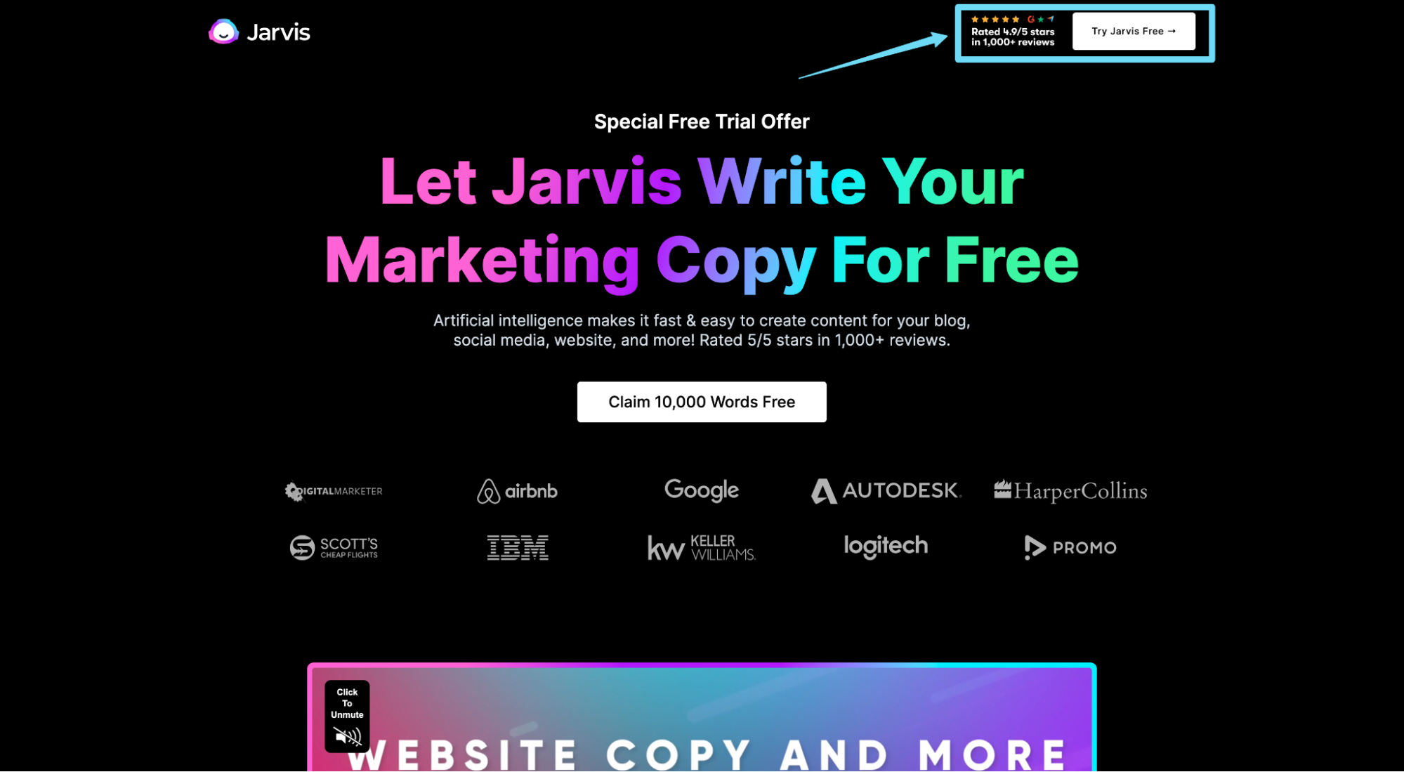
Sure, it’s a good idea to create a social proof section on your landing page like Jasper (formerly Jarvis) does here:
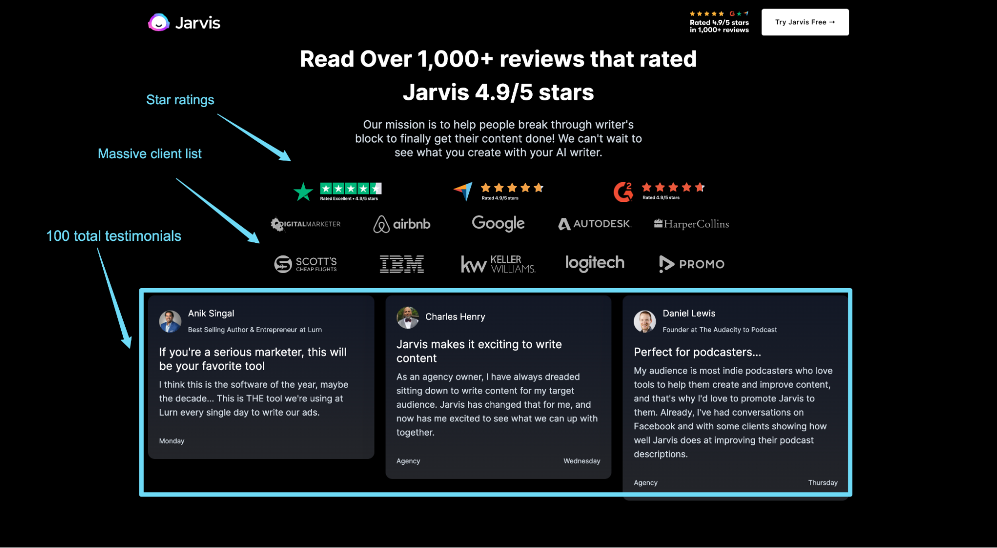
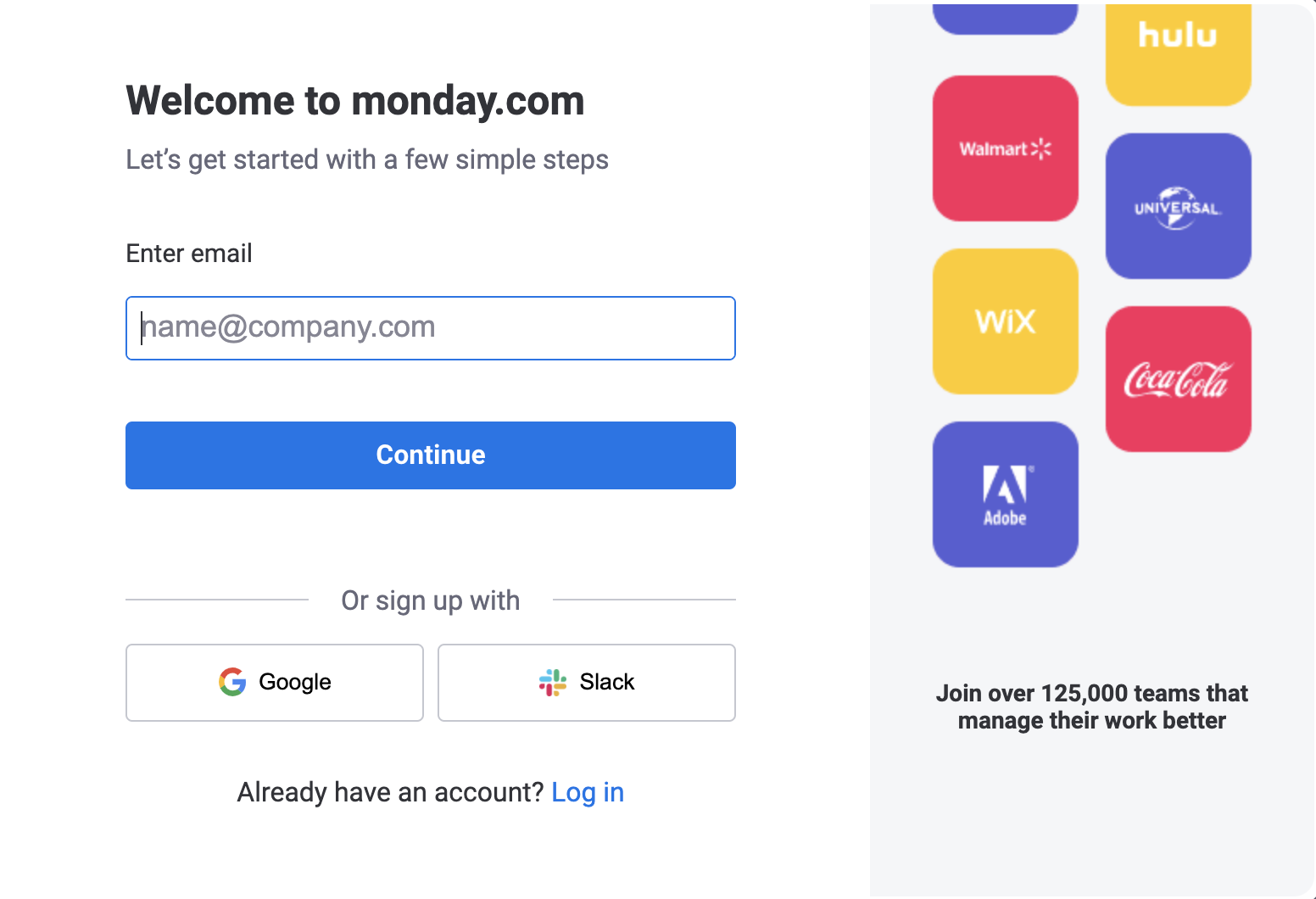
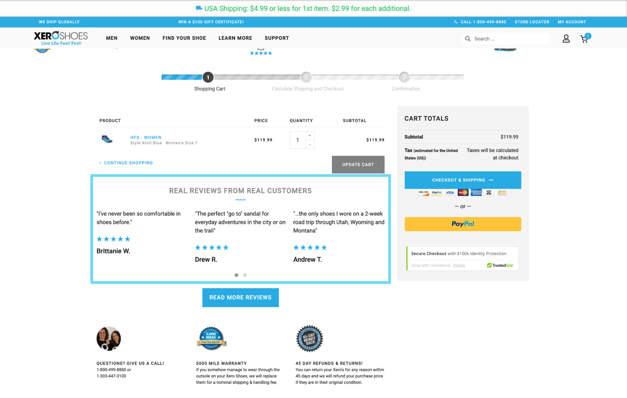
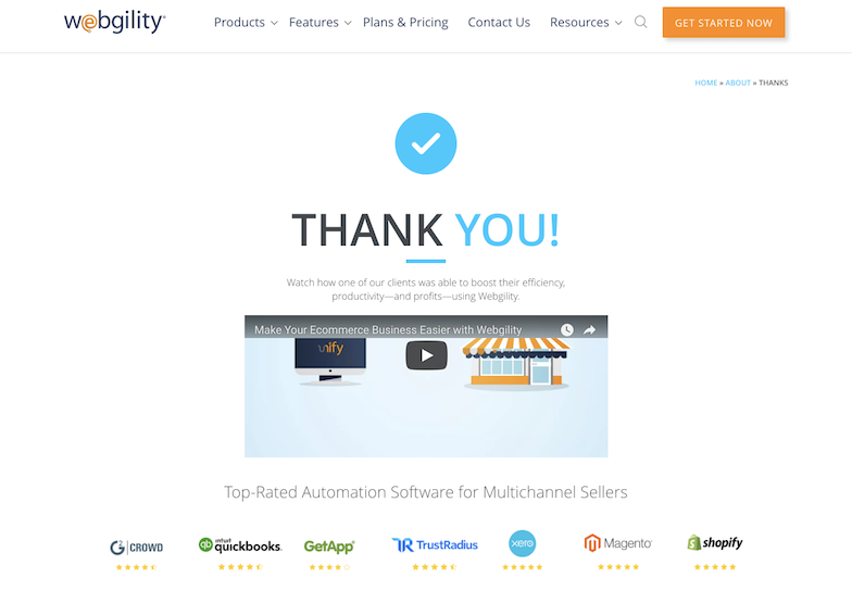
But every other touchpoint of your landing page should include social proof as well. Include social proof in/on your
- click triggers
- forms
- checkout page (for eCommerce)
- thank you page
Click triggers: A click trigger is micro-copy near or around your CTA button that tempers anxiety and handles objections. Use click triggers to spotlight social proof. After all, this is where every potential customer is going to look.
Form: Once prospects click on your pop-up form, that doesn’t mean your job is done. Feature relevant social proof to nudge prospects forward.
Checkout page: Similar to a form, these prospects are almost there. Remind them that they’re making the right decisions by showing them how many people already made the same decision.
Thank you page: Like we mentioned previously, keep your prospects engaged all the way through to the thank you page.
7. Prioritize downstream metrics
How do you know if your landing pages are impacting real business results?
Downstream metrics: revenue, profit, sales, lead quality, pipeline velocity.
While clicks, conversions, and cost-per-click (CPC) all have their place, they don’t tell you much about whether or not your ads and landing pages influenced real business outcomes.
For example, pretend CPC of a high-intent branded search keyword costs $10 a click, and you convert 10% of traffic on a “Book a demo” CTA. Now pretend the CPC of a low-intent display ad costs $1, and you convert 1% using the same CTA.
Cost per acquisition (CPA) for both equals $100, right? Right.
Sounds good, no? Sure does. It might take way more traffic for display ads to reach the conversion volume of paid search ads, but it ends up costing the same, right?
Wrong.
When you take a closer look at downstream metrics, low-intent leads bloat your pipeline with trash, take up more of your sales reps’ time (inefficient funnel/slow pipeline velocity), and don’t end up converting anyways. Or, if they do, they don’t find value in the product (because they’re not ready for it).
This is how upstream metrics like clicks, conversion rates, CPC, and even cost per acquisition (CPA) mislead marketers and CRO specialists when divorced from their downstream counterparts.
But let’s look at some sample data.
At first glance, when you analyze Keyword 1 and Keyword 2 below, it appears like Keyword 2 dominates, right?
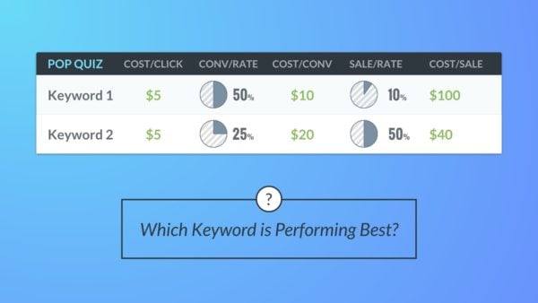
But upon closer inspection (ahem, looking at your downstream CRM data), things start to look decidedly different:

The lesson?
Upstream metrics don’t tell the full story.
Always check downstream metrics like sales, sales cycle (velocity), lead quality, revenue, and profit to measure the real performance of your landing pages and marketing campaigns. This means monitoring your CRM, not just your ad dashboard.
If you’re not using downstream metrics to measure offer/intent alignment before you run your landing page tests, take a pause.
Garbage in is garbage out.
Closing thoughts on landing page optimization and hacks
Let’s be honest—the word “hack” isn’t the best way to describe marketing efforts.
There is no shortcut to effective landing page design. Just like there is no silver bullet or magic beans.
But over the course of several years and thousands of A/B tests, we can tell you with confidence that certain landing page tactics produce more results with less effort than others.
Call them hacks, call them tips, call them tactics, call them whatever you want.
Just ensure you implement them today, whether you’re a startup, eCommerce shop, small business owner, or enterprise behemoth.
But now that you know what to do with your landing pages, you should just as much know what not to do with them.
